Choosing paint colors that will appeal to buyers matters in Central Texas, TX because climate, light, and regional style shape how colors read in a room. A thoughtful palette can improve perceived space, highlight architectural features, and create an inviting atmosphere for a home-buying audience. The sections below explore practical strategies for each key area of a house. Each section explains why choices matter, offers specific examples, and gives actionable tips for getting results that resonate with local buyers.
Entryway And Exterior AppealCurb appeal sets expectations before the front door opens. Exterior paint that complements natural stone, brick, or stucco helps a property blend with its surroundings while still standing out in a tasteful way. Consider neutral siding tones paired with a moderate contrast on trim and doors to create visual interest without overpowering the facade. A deep, muted color for the front door provides a focal point and signals care. Keep finishes durable to withstand sun exposure and occasional heavy rain common in Central Texas, TX. A consistent palette from porch to entry creates harmony and makes photographs look cohesive.
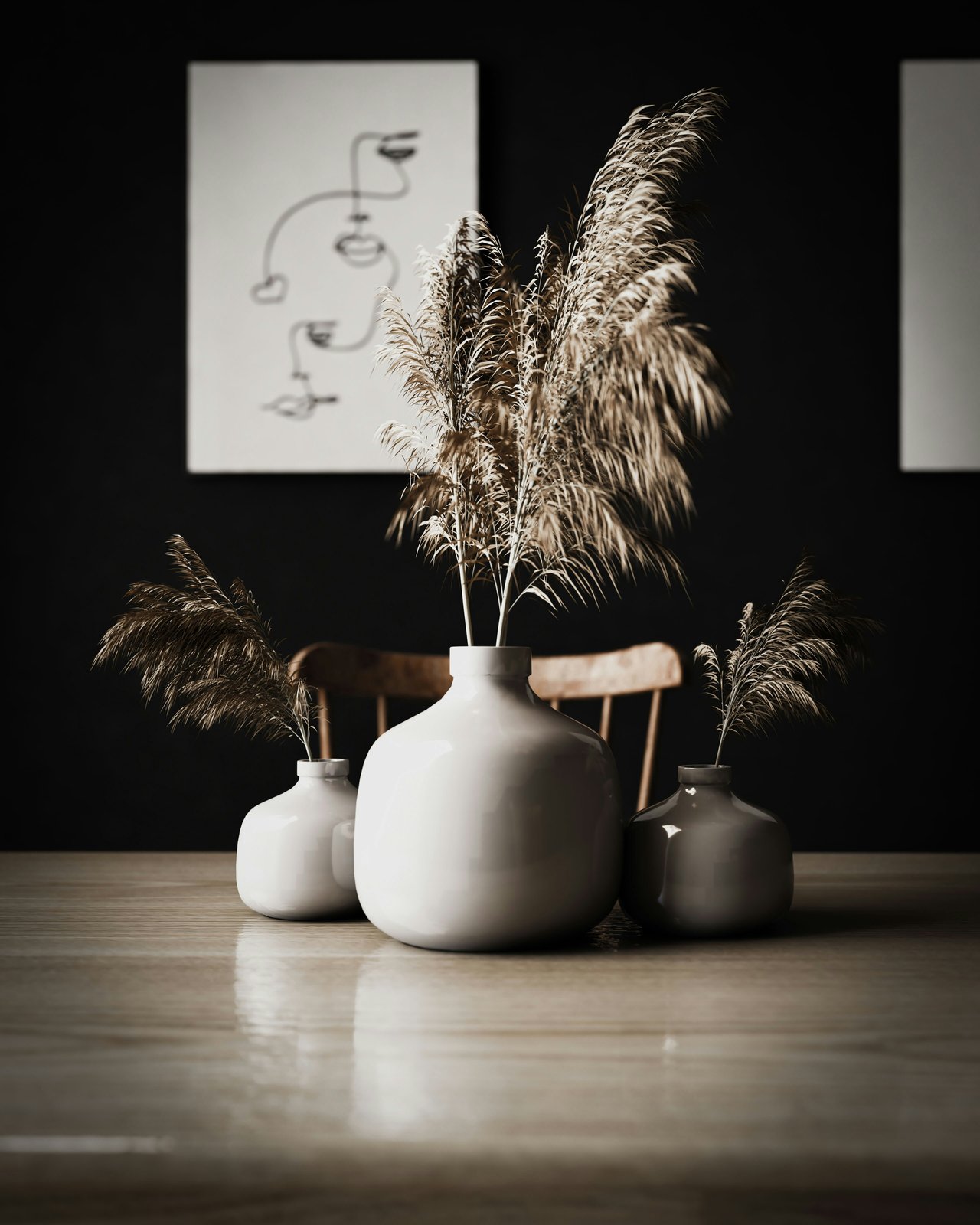
Living Room And Open SpacesLiving areas sell when they feel spacious and welcoming. Soft, warm neutrals open a room and enhance natural light. Select a base color that reads as clean in both daylight and artificial light. Use a slightly deeper accent on a fireplace wall or built-in shelving to anchor the space. When staging, subtle contrast between walls and trim helps architectural details pop. Choose low-sheen finishes to hide minor imperfections while keeping surfaces easy to clean. For homes with large windows that capture afternoon sun, cool undertones can prevent washed-out photographs.
Kitchen And Dining AreasKitchens influence buyer decisions through a combination of color and function. Light, neutral cabinetry paired with a gentle wall color keeps the room feeling fresh. For a modern look, a cool off-white on walls balances stainless steel fixtures and stone counters. For a classic feel, warm creams pair well with wood tones. Paint on trim should be crisp to suggest newness. Consider an accent color on an island or a single wall to create a memorable focal point that works with common cabinet finishes. Matte or eggshell sheens are appropriate for walls because they resist stains while avoiding reflectivity that distracts in listing photos.
Primary Bedroom And Retreat SpacesBedrooms should feel calm and restful. Soft, muted tones promote relaxation and allow bedding and decor to stand out. Pale shades with subtle undertones create a blank slate that appeals to a broad range of buyer preferences. Use the same color on ceiling and walls for a cozy effect in smaller rooms. When a bedroom receives eastern light, choose tones that warm gently in the morning. In rooms with less natural light, slightly warmer neutrals prevent a hollow appearance. Trim should match or be a touch lighter than the wall to maintain a polished look.
Bathrooms And Powder RoomsBathrooms read as fresh when colors emphasize cleanliness. Crisp neutrals and soft grays give a contemporary feel and pair well with chrome or brushed metal fixtures. In powder rooms, a more assertive color can create personality without overwhelming a buyer. High-humidity areas require paint designed for moisture resistance. Semi-gloss finishes on trim and doors make cleaning easier and reflect light to brighten compact spaces. Coordinate tile and vanity tones with wall color samples in place to ensure accurate color perception.
Home Office And Flexible RoomsWorkspaces benefit from colors that enhance focus and comfort. Neutral walls provide a calm backdrop for shelving and equipment. A gentle cool tone can reduce eye strain under artificial light. For rooms that double as guest or hobby spaces, choose paint that reads neutral to most visitors while still offering subtle character. Accent walls can delineate zones without committing the entire room to a bold color. Shelving built-ins painted slightly darker than the walls create depth and a refined custom appearance.
Children’s Rooms And Specialized SpacesChild-focused rooms should balance livability with broad appeal. Soft, cheerful shades work better than saturated primaries because they photograph well and do not overpower decor. Use washable paints and finishes that tolerate frequent cleaning. Consider two-tone treatments with a darker lower portion that hides scuffs and a light upper portion that keeps the room airy. When working with whimsical themes, limit bold color to an accent area so the space remains market-friendly later.
Trim, Ceilings, And Finish DetailsTrim and ceiling choices influence perceived quality. A consistent trim color throughout a home makes transitions feel intentional. Slightly warmer whites add softness under warm light, while cooler whites brighten rooms with cooler-toned light. Ceilings painted a touch lighter than walls visually raise height. Avoid high-gloss paints on large surfaces because they emphasize imperfections. Match finish choices to room function — higher sheen where cleaning is frequent, lower sheen where imperfections should be minimized.
Photography, Staging, And Lighting ConsiderationsColors must perform well in listing photos and showings. Test paint samples on different walls and observe how they look at morning and evening hours. Artificial lighting alters perception — warm bulbs bring out yellow undertones while cooler bulbs reveal blue or gray aspects. Stage rooms with neutral textiles that complement wall colors to emphasize warmth and scale. Photographers often prefer consistent white balance across images, so avoid mixing too many undertones within contiguous rooms.
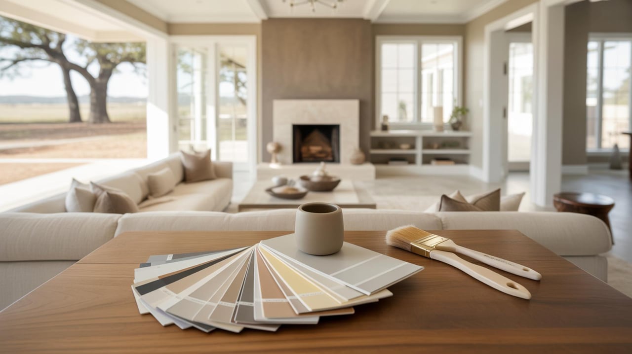
Selecting Paint Samples And TestingTesting is essential for confident decisions. Paint a few large swatches on multiple walls and live with them through a few light cycles. Observe how colors read from hallway vantage points and when photographed. Test finishes as well as hues; sheens change the way color reflects light. If a color shifts toward an unintended undertone in different light, try a nearby shade with a slight adjustment. Keep sample areas tidy so they do not distract during showings.
Collaborating With A Real Estate Agent And ProfessionalsWork with a real estate agent and painters who understand local buyer preferences. Real estate professionals can advise on colors that resonate with home-buying trends in Central Texas, TX and help prioritize rooms for repainting. Professional painters bring skill in surface prep and consistent application that improves final appearance. Share color swatches with staging specialists to ensure furnishings and textiles complement the palette. Request references and view completed projects before committing to a contractor.
Maintenance And Longevity Of Chosen ColorsMaintenance extends the appeal of paint choices over time. Opt for paints that resist fading and are formulated for the local climate. Cleanable finishes on high-traffic walls reduce the need for frequent touch-ups. Keep a small container of each color for future repairs so touch-ups blend seamlessly. Regular inspection of exterior paint will prolong the life of the finish and maintain curb appeal between sales periods.
Ready to Make Colors Work for Your Sale
Choosing the right paint colors can transform buyer perception, highlight a home's best features, and help your listing sell faster. Stick to neutral bases with strategic pops of color, and remember that consistency across rooms creates a cohesive flow buyers love. For expert guidance and tailored recommendations, visit soldbychristiem.com. Contact us today to get a personalized color plan that maximizes your home's appeal and sale price.